The user experience, or UX, is the cornerstone of any e-commerce page. Many companies have gone to great lengths to optimize their pages to ensure that they’re the highest converting pages they can possibly be. After all, selling is the goal.
Most people don’t change the default shopping cart or product pages. They just look at the design aspect, and not how the user will actually experience it. It’s kind of like having a really great looking sports car, but with poor acceleration, breaking and steering. Looks great, but not really doing the job.
You’ll want your product page to follow some of the same rules that great content uses – like making the page easy to scan and understand. This will greatly improve the user’s experience.
Here are a few tips to help you optimize the UX of product pages.
Name of Product
This is likely to be one of the things that stands out most on your page. You want the user to know exactly what the product is without too much effort. Sometimes there’s a tendency to keep this generic, but you should do the opposite to make it user friendly.
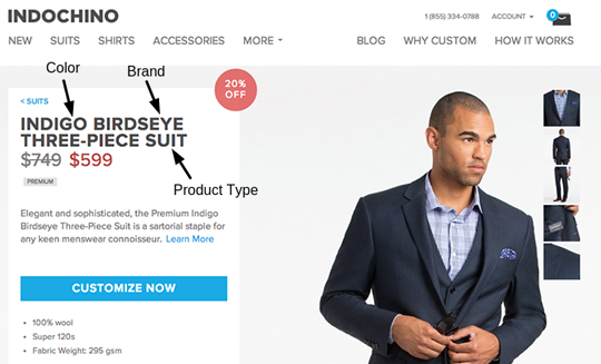
People don’t want to guess if it’s the product they’re looking for, so be specific. It’s also better for SEO the more detailed you can be:
Bad: Necklace
Good: Beaded Wooden Necklace with Metal Clasp
Call to Action
Make your call to action clear, and visible. On a product page, your CTA is going to be pretty simple. Usually it’s adding to a shopping cart. There are a few things you can do to make your CTA more effective:
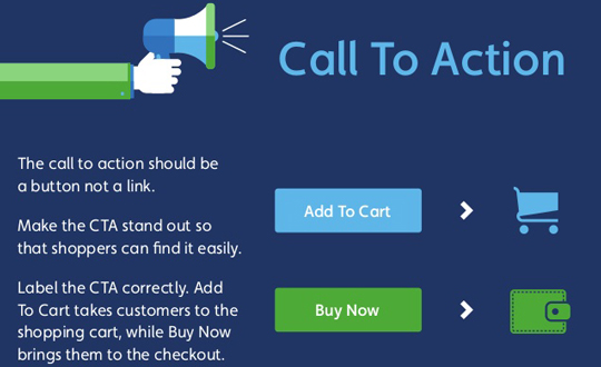
– Make it stand out with color. Have it contrast with the page so it is obvious.
– Put it near the product and description.
– Have it above the fold. The further you have to scroll, the less effective it is.
– Make the process as easy as possible. If you have multiple options, try to keep the selection process or dropdown box by the CTA. Don’t have the user go through several pages if you can avoid it.
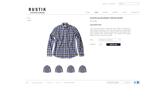
Awesome Product Photos
A photo is worth 1000 words – especially when it comes to your product. You may be tempted to save a few bucks and do it yourself. You better hope your work is solid. Crappy pictures will not help your sales. You want to show your product in the best light possible.
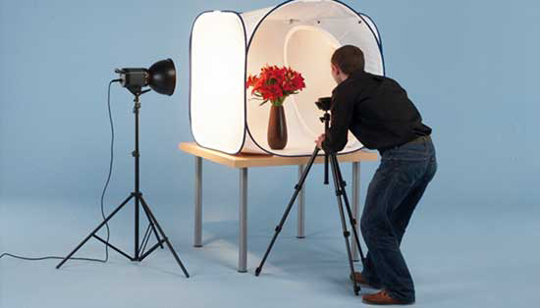
Also, make the product image as large as possible. Give people a real clear look at the item you’re selling. E-commerce sites have found larger photos lead to a 9% increase in sales.
Product Reviews
Most e-commerce sites know the value of having reviews. If you’re still not sure how this improves the user experience, the data is in. One study has shown that just having reviews increases conversions by 400%.
It’s not just having reviews, but also the number of reviews. Products with more than 20 reviews convert better than products with only a few reviews. Find a way to add reviews to your site. Solicit past product purchasers, give incentives, but make sure the reviews are there if you’re looking for the best UX.
Simplify Your Product Pages
Don’t clutter your pages with too many related products, upsells, or extra info. Leave lots of clean blank space and make the page easy to navigate. It’s really easy to want to try and get all the info on your product page in the hopes they’ll visit other parts of your site. However, this approach can have the opposite effect.
If your page is too busy and distracting, you can actually pull the reader away from your desired goal of having them add the product to the cart. It can be one reason for low conversions. If you put a really exciting link in the sidebar, people may be too excited to finish what they’re doing. Keep things simple.
Simplify Copy and Descriptions
Like we mentioned off the top, content optimization is important to most websites that publish original material, and your product page is no different. Endless copy with countless features is not required.
You want to keep you copy simple, concise, and talk about benefits – not features. It’s ok to list features, especially in a product that is comparable to other products. Many people will compare features. However, if you’re audience can’t relate the feature to the benefit, you should to fill in the blank. If a feature of your product is “twice as small”, you can also state the benefit “so it fits in your pocket”.
Eliminate as much of the product description as you can that is not needed. No product ever needs five paragraphs of copy to explain what it does. Keep it simple, and move on.
Test Your Pages
Every product and e-commerce site is different. Test your pages thoroughly. Split testing doesn’t need to be complicated, you just have to remember not to change too much at once. Try changing one small element, let it test for a while, then test another.
Here are a few things you can test to achieve the best performance:
– Color and placement of your CTA.
– Text and picture size.
– Change up the headline and descriptive text.
– Change features into benefits.
– Change the placement of related products.
– Reduce copy and simplify page. Find out if more text, or less text, helps conversions.
There’s no magic solution for the best user experience. It’s a very personal thing for every site and you need to find what works best for yours. Using the above tips is a great place to start and will get you on the right track.


