Does your website represent your business perfectly?
Is it delivering the message it was meant to?
If no, your website is probably killing your sales.
Yes, you read it right.
Creating a profitable website is difficult. And the web design process is a veritable minefield of errors. If you make these errors, the efficacy of your website goes down. When it comes to mistakes, designers believe they can get away with many as website visitors won’t notice them or just ignore these mistakes.
They forget this is a highly competitive world they are living in, and website visitors have a plethora of options to choose from. If your website doesn’t pass muster, they will move on to another.
So, it’s imperative you don’t make even those mistakes you think, you can get away with.
Let’s take a closer look at some of these mistakes:
Did you forget to focus on the search box design?
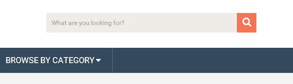
A search box is an absolute must on content heavy sites. It plays a crucial role. While most designers don’t forget to implement a search box they forget/ignore a crucial element of the search box – its design.
They believe all a search box needs are two simple elements: Input Field and Submit Button.
You might be thinking how much of a role can design play in a search box?
Well, it plays a big role.
Its design must be perfect.
Why?
If it is not, the input field may be too short, the text displayed in the input field might not be legible, the submit button might not even look like a button and worst of all, the search box might not be easy to spot or isn’t intuitive.
Bottom line: The design of the search box is a big deal.
When users come across a relatively complex navigation system, the search box acts like a savior. It helps users get to their final destination quickly and painlessly.
A good search engine box must be clearly visible, easy to use, quickly recognizable and must give users enough space to input their queries. Stick to simple design as it usually works best.
Font selection can confuse or please your user
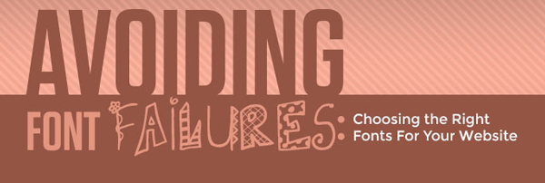
So you have the website design all worked out, the layout is perfect and even the use of images is great, but did you forget about the font style and how difficult it can get for your visitors to read website text?
Unfortunately, font style and size, one of the most vital design elements of your website is also very often the last consideration.
Do your visitors have to squint their eyes or lean forward to go through your website content? If that’s the case, you probably have used inappropriate font style and size. This impacts legibility, which more often than not leads to increased bounced rate.
As a designer you must understand that choosing the right font and size ensures visitors understand the core purpose of your website. Also, font style gives your website its character.
So, don’t mess it up.
Don’t let your website be a navigational nightmare
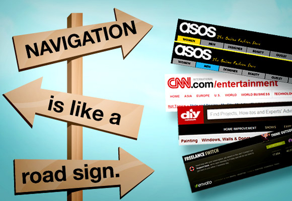
The ruin of any good website is bad navigation. This is one of the major aspects you shouldn’t ignore.
Keep in mind the three C’s of navigation: Clear, Concise and Consistent, while crafting the navigation for your site.
Create a navigation system that makes the reader feel comfortable, is familiar and allows them to quickly access the information they need.
Points to remember:
Excessive creativity can just be excessive
A good website is not just about how it looks. It’s about how it works.
A few years back form and function used to play an equally important role, but now the scales tilt in favor of functionality.
Why?
Users, these days, have the attention span of a gnat. If they don’t get the information they are searching for quickly and conveniently, they will immediately switch to some other website.
Yes, visual appeal plays an important role, but focusing more on this aspect rather than the technical aspects is just wrong. Functionality is the foundation for a great user experience. Moreover, excessive creativity can just be excessive and very distracting.
You should know where to draw the line. Here’s what you must do:
Avoid too much clutter, say yes to whitespace
Even if you want to convey a truckload of important information to your target audience, it still doesn’t make sense to cram it all on your web pages. Not only is it hard on the eyes of visitors, but also an important reason for lost sales and revenues.
When a website visitor arrives on a site which has information in excess, it leads to one of these things:
On the other hand, white space is the key to elegant website design. It speeds up interaction, makes your CTA’s stand out and most importantly, makes your website easier to understand.
Your website is your business’s face to the world. If it’s clean and devoid of any clutter, you will gain more customers from it. If it is confusing and its message muddled, you will lose business. Nobody wants to go through a busy, cluttered and unreadable page. White space can make your website better and more profitable.
Calls to Action buttons don’t stand out

That button on your website isn’t just any tiny button. It needs to be fully loaded with all your conversion wisdom and power. This small button can make or break any online business.
Calls to action buttons are not just limited to being attractive. While designing an effective button, you must choose qualities that perfectly fit your niche and audience.
If you want your call to action buttons to get your visitors to actually do something, here are few things to bear in mind:
By applying these tips, your buttons will not only convert more visitors into leads but also leads into paying customers.
Multiple new frames is not a cool thing anymore
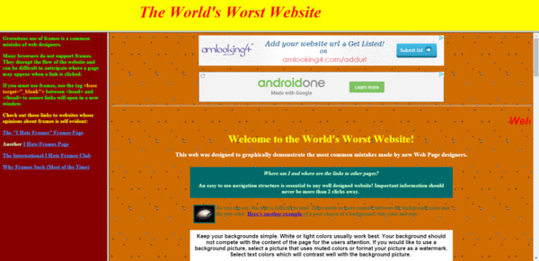
Using multiple new frames to display content was very popular once upon a time.
But that just isn’t the case now.
Breaking a page using multiple new frames not only confuses the users but also annoys them to a great extent. It ties up system resources, slows computer response; and it generally complicates a visitor’s experience. These frames can be a huge turn off.
Think of the potential customers you will lose!
Instead, avoid them and opt for a well-designed website structure using tables or layers.
Too many barriers for Registration
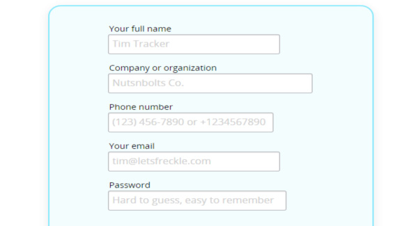
Registration forms are tricky.
There’s so much to consider: captchas, confirmation emails, account activation, and credit card details. User registration can indeed be a headache. Some websites make most registration fields mandatory and validate the fields to the extent where the user is frustrated after a few tries.
Remember, users visit a website to acquire information. Not the other way round.
The best solution for this problem is to compare registration forms across businesses on the web and understand what basic information is required from the user during the registration process and how you can make it simple for your user. You then implement this learning on your site.
Also, stay away from a tendency to ignore the design of registration forms. This is a mistake, because you can make an effort to design registration forms in a way that encourages visitors to fill them up. Visually appealing registration forms have the potential to improve conversions.
Old is not gold in this case
Relevant and timely content is one of the most important traits of a great website. In fact, this is what drives traffic to the website.
You’ve set up your website to drive your business growth, so you should always make sure that the content you feature on it has the potential to engage your target audience.
On the other hand, out-dated content can play a big role in generating confusion and mistrust amidst your customers.
Remove outdated content related to:
Website Testing
Test, Test and Test your website usability.
This is one of the most crucial things to keep in mind. Your users are not looking forward to any unpleasant experiences.
To ensure your visitors are able to use your site effectively and efficiently, you need to make sure of the following things:
Now that you know about these mistakes, you are better placed to avoid them. It’s time to make your website more effective and get your profits soaring.